Business Analysis
Tour Operator Dashboard — Requirements & Data
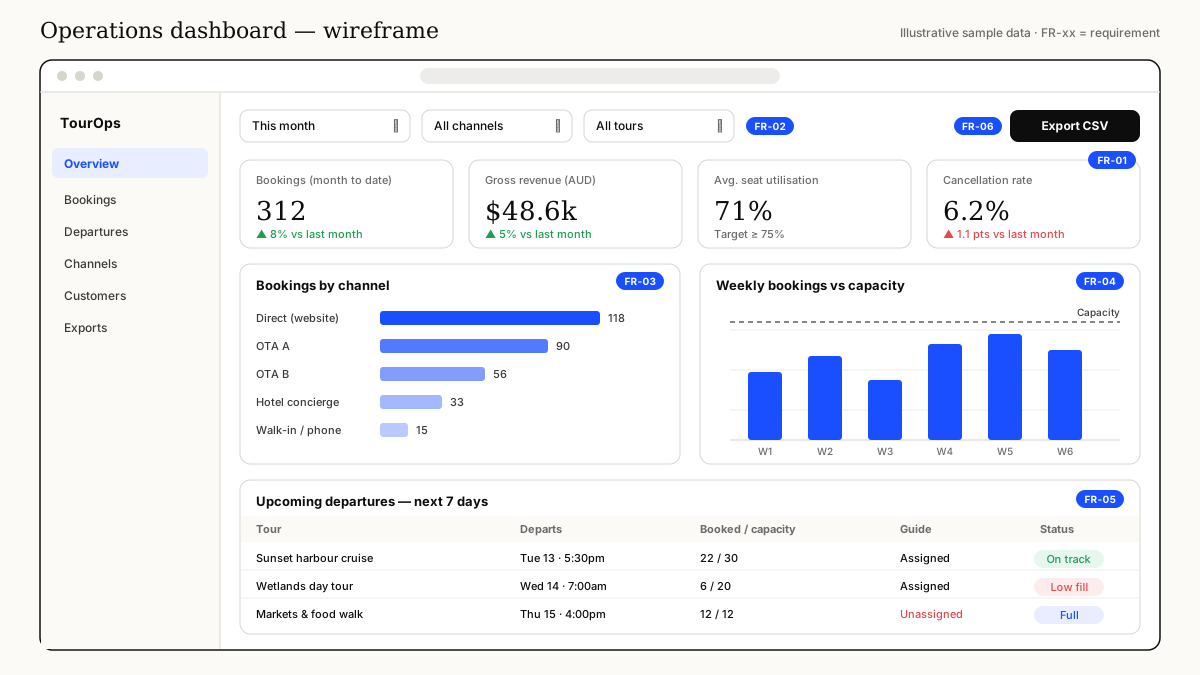
Concept case study: turning a tour operator's spreadsheet-based reporting into a clear dashboard specification — KPI definitions, a conceptual data model, and a wireframe that answers the questions the owner actually asks every Monday.
Context
A self-initiated practice case study inspired by my background in family tourism in Bali, set around a fictional small tour operator in the Top End. The business, numbers and channels shown are illustrative sample data.
In the scenario, the owner pulls exports from a booking platform and two online travel agencies (OTAs) into a spreadsheet every week. It takes half a day, numbers don't match between sources, and decisions about which tours to run or promote are made on gut feel.
Business questions
Before touching any screens, I worked with the (simulated) owner and operations lead to agree the questions the dashboard must answer:
- Are we on track for the month — bookings and revenue vs last month?
- Which channels bring bookings, and what do they cost us in commission?
- Which upcoming departures are under-filled and need promotion — or should be cancelled?
- Is our cancellation rate rising, and on which tours?
Requirements
- FR-01 (Must) Show headline KPIs: bookings, gross revenue, seat utilisation and cancellation rate, each compared with the previous period
- FR-02 (Must) Filter all views by date range, channel and tour
- FR-03 (Must) Break bookings down by channel
- FR-04 (Should) Show weekly bookings against capacity
- FR-05 (Must) List departures in the next 7 days with fill status and guide assignment
- FR-06 (Could) Export the current view as CSV for the accountant
- NFR-01 (Must) Data refreshed at least every hour; page loads in under 3 seconds
Wireframe
Data model & KPI definitions
The biggest risk was the same word meaning different things in different sources — "booking" in one OTA export counted passengers, in another it counted orders. I defined a single conceptual model and wrote every KPI against it, so the numbers can be traced and tested.
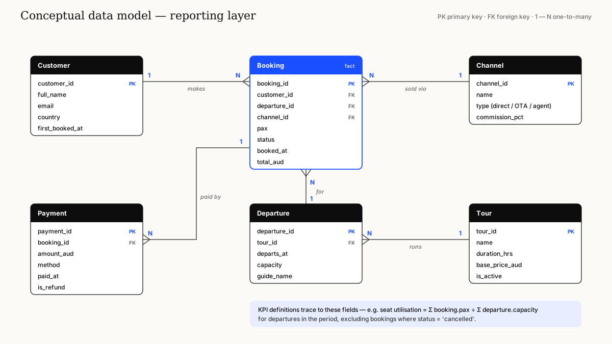
- Seat utilisation = total booked pax ÷ total capacity for departures in the period, excluding cancelled bookings
- Cancellation rate = cancelled bookings ÷ all bookings created in the period
- Gross revenue = sum of booking totals (AUD) before channel commission and refunds
Deliverables
- Business questions and KPI glossary, agreed with stakeholders
- Prioritised requirements (MoSCoW) with acceptance criteria
- Conceptual data model and source-to-field mapping
- Annotated dashboard wireframe
What I learned
Agreeing definitions first saved more time than any visual design work. A dashboard is only trusted if everyone agrees what each number means — that's a business analysis problem before it's a reporting problem.